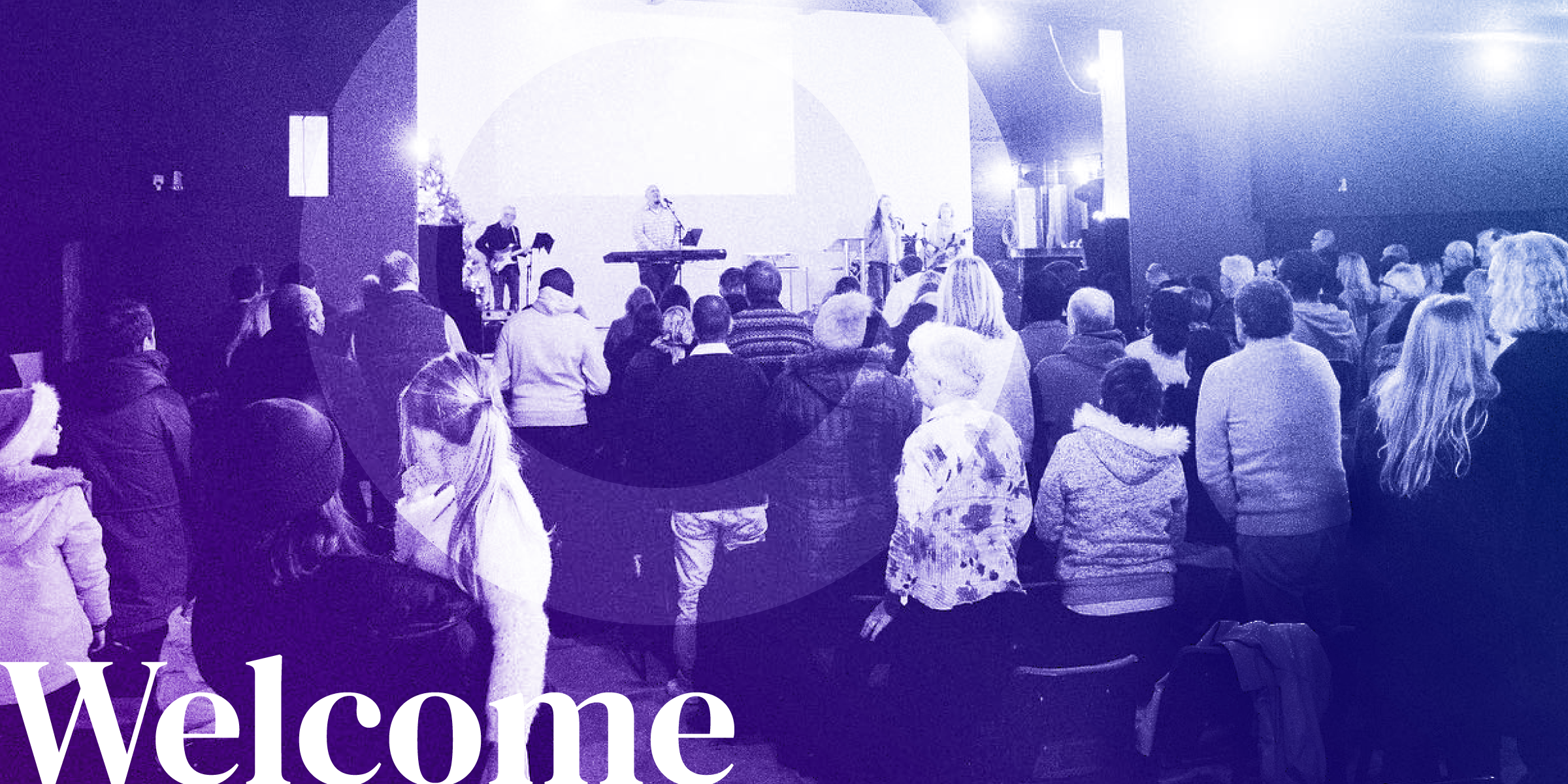
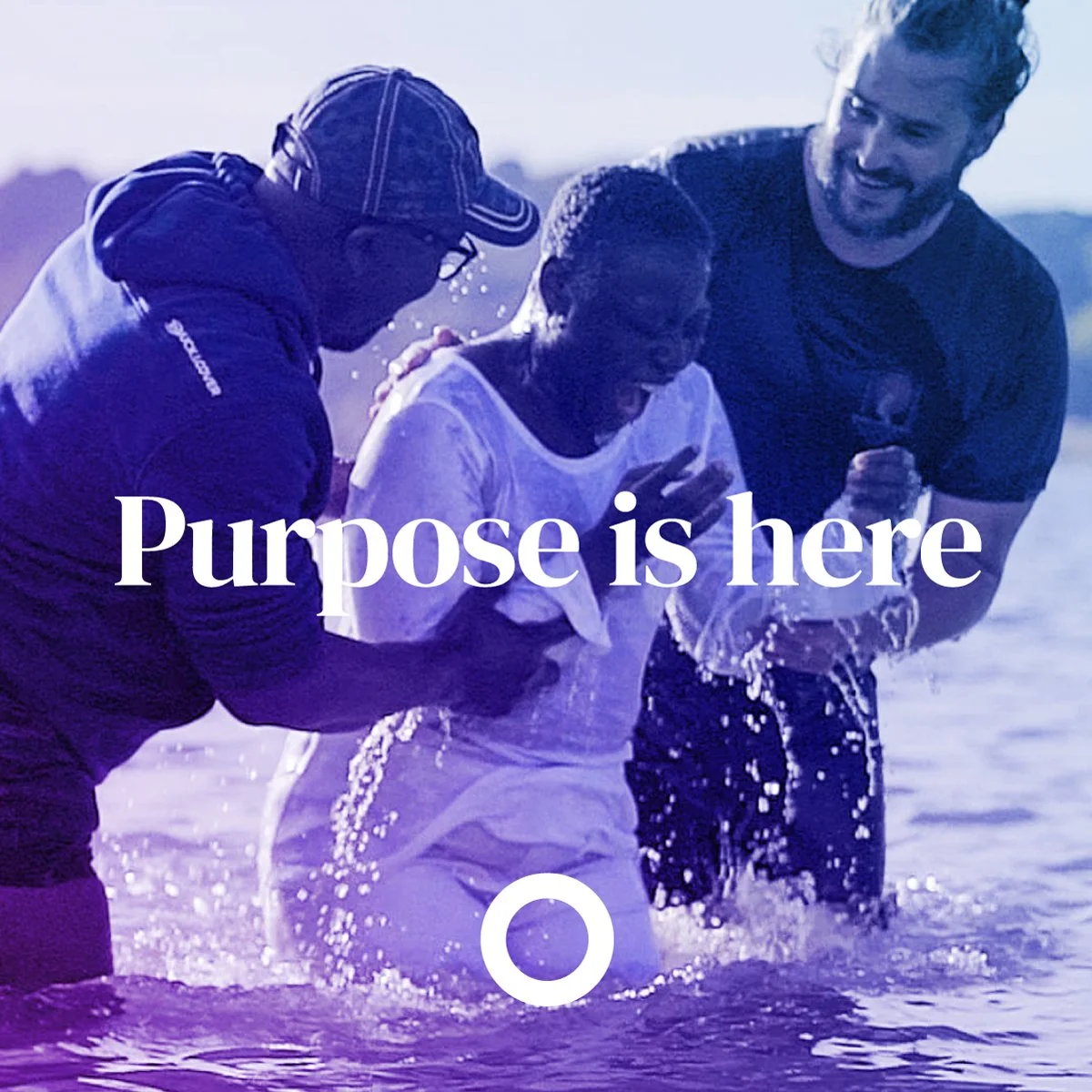
A lively community sharing life together
Freedom Church | 2023
Brand Identity
The Goal
A brand refresh for Freedom Church to make people feel:
- Encouraged
- Home / Family / Comfortable
- Hope-filled
- Safe
- Inspired
In their words:
Everyone needs community. In an individualistic culture, it’s easy to become lonely/isolated. We offer community to people.
The Solution
The evolution of the brand, with a new wordmark and brandmark. Something that had a personality and versatility. That is purposeful and also symbolic:
Circles
The circle is often used in a logo to represent unity, commitment, love or community.
Circles have no beginning or end, they represent life and the lifecycle.
Ring
Unity/union. Unbroken. Strength. Completion/becoming whole. The sun. Light at the end of the tunnel. Centre. Rings of age/Wisdom. Marriage. Bond.
—
The gradient represents diversity and vibrance. The positivity that spreads when you combine as a whole church together.
Freedom is written in a serif font, bespokely formed to join together, like the members of the church.
Church is in bold and in caps to represent the foundation and core strength it gives the members.


